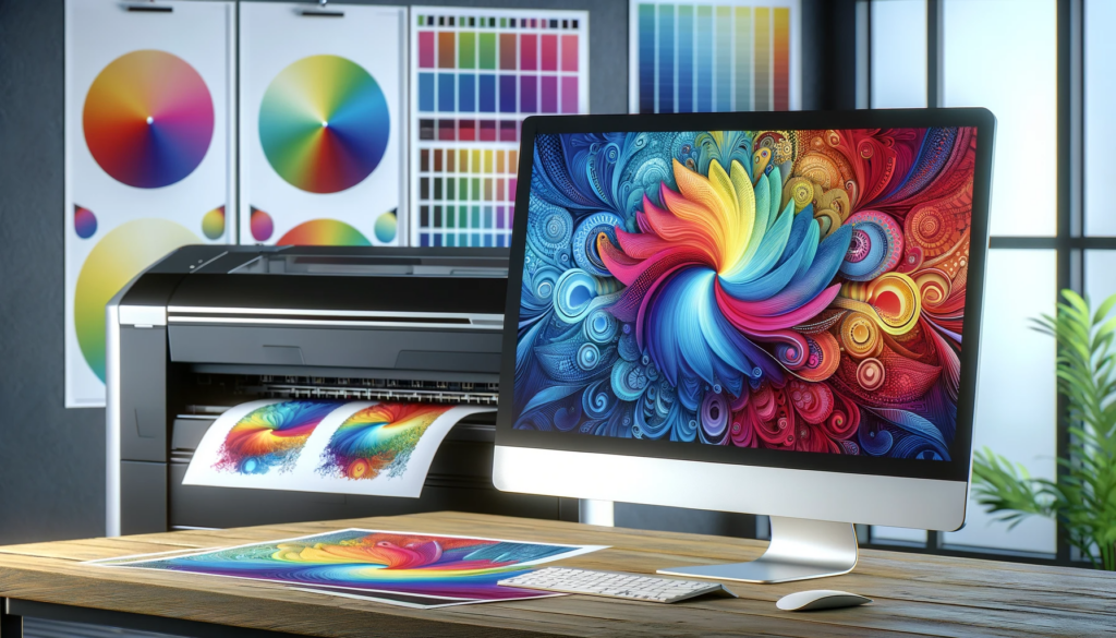
One of the initial challenges you’ll face when you begin printing your artwork is the surprising difference in colors. What appeared vibrant and precise on your computer screen often emerges differently on paper, sometimes appearing washed out or inaccurately represented.
This common hurdle for designers and artists stems from the distinct ways in which screens and printers handle colors. To bridge this gap and ensure your printed artwork faithfully reflects your digital design, understanding and previewing in CMYK is crucial.
Here’s a comprehensive guide to navigate through this essential process, making sure the colors you choose are the colors you get.
Understanding CMYK and Its Importance:
- What is CMYK?
- CMYK stands for Cyan, Magenta, Yellow, and Key (Black). It’s a color model used in color printing where colors are created by mixing these four inks.
- Unlike the RGB (Red, Green, Blue) model used for digital displays, CMYK is subtractive, meaning colors are “subtracted” from white light as the paper absorbs certain wavelengths.
- Why Preview in CMYK?
- Printers use the CMYK model, so previewing in CMYK allows you to see a more accurate representation of how colors will look when printed.
- RGB has a wider color gamut than CMYK, meaning some colors visible on a monitor cannot be replicated with standard printing inks. Previewing in CMYK helps identify these discrepancies.
Step-by-Step Process for Previewing Images in CMYK:
- Use Appropriate Software:
- Choose design software that supports CMYK and color management (Adobe Photoshop, Gimp, Illustrator, InDesign, etc.).
- Designing in RGB:
- Start your design in RGB mode to take advantage of the broader color range.
- This is especially important for complex graphics or images that require a lot of color details.
- Monitor Calibration:
- Calibrate your monitor for accurate color representation. This can be done with calibration tools or software.
- Converting to CMYK:
- Once your design is nearing completion, convert a copy of the image to CMYK mode in your software. This is often found under ‘Image’ > ‘Mode’ > ‘CMYK Color’.
- Remember, this is for preview purposes. Keep your original design in RGB.
- Soft Proofing:
- Use the soft proofing feature to see how your design will look with different CMYK profiles.
- This can be done in Photoshop under ‘View’ > ‘Proof Setup’ > ‘Custom’. Choose a CMYK profile that matches your printer’s specification.
- Adjusting Colors:
- After converting to CMYK, you may notice some colors look different. This is the gamut difference between RGB and CMYK.
- Adjust colors as needed to ensure they look as close as possible to your intended design.
- Saving for Print:
- Save your CMYK-converted file in a format suitable for printing (like TIFF or PNG).
- Ensure you include bleed, crop marks, and any printer-specific requirements.
- Printing a Proof:
- Print a test copy on the printer you intend to use or a similar one.
- Check the proof against your monitor to see if further adjustments are needed.
Additional Tips:
- Environment Consistency: Work in a consistent lighting environment to ensure color accuracy.
- Communication with Printers: If using a professional printing service, communicate with them about their specific CMYK profile and printing requirements.
- Regular Updates: Keep your software and color profiles up to date for the best color accuracy.
Conclusion
Previewing your images in CMYK for printing is crucial for color accuracy. It allows you to adjust your design to compensate for the differences between RGB and CMYK color models, ensuring that the final printed product looks as close as possible to your digital design.
Remember, the goal is to achieve color consistency and predictability from your digital design to the printed outcome.
Hi, I’m Carmine, the guy behind Helpful Tiger. Tired of crappy search results? Me too. That’s why I started this website. It’s a one-stop shop for simple tutorials and guides on a little bit of everything. Have questions? Reach out, and I’ll do my best to help!


